project background
2014 was a busy year at AppDirect—we expanded our headquarters in San Francisco, deepened our international roots with the opening our Montreal engineering office, and more than doubled our headcount company wide.
We were eager to create a book that would document AppDirect's whirlwind growth, connect colleagues to one another, and capture the feeling of maturation that really marked the theme of the year.
Approach
To evoke those feelings of evolution and maturity, we took a more polished and minimal design approach in order to really raise the bar above the previous year's efforts. Our design approach relied heavily on a lot of thoughtfully composed black and white photography, judicious use of white space, and a confident pairing of sans-serif and serifed typography.
ROLE
- Design and layout, concept development, copywriting
NOTES
- 7" x 9" perfect-bound book, 276 pages, produced at AppDirect

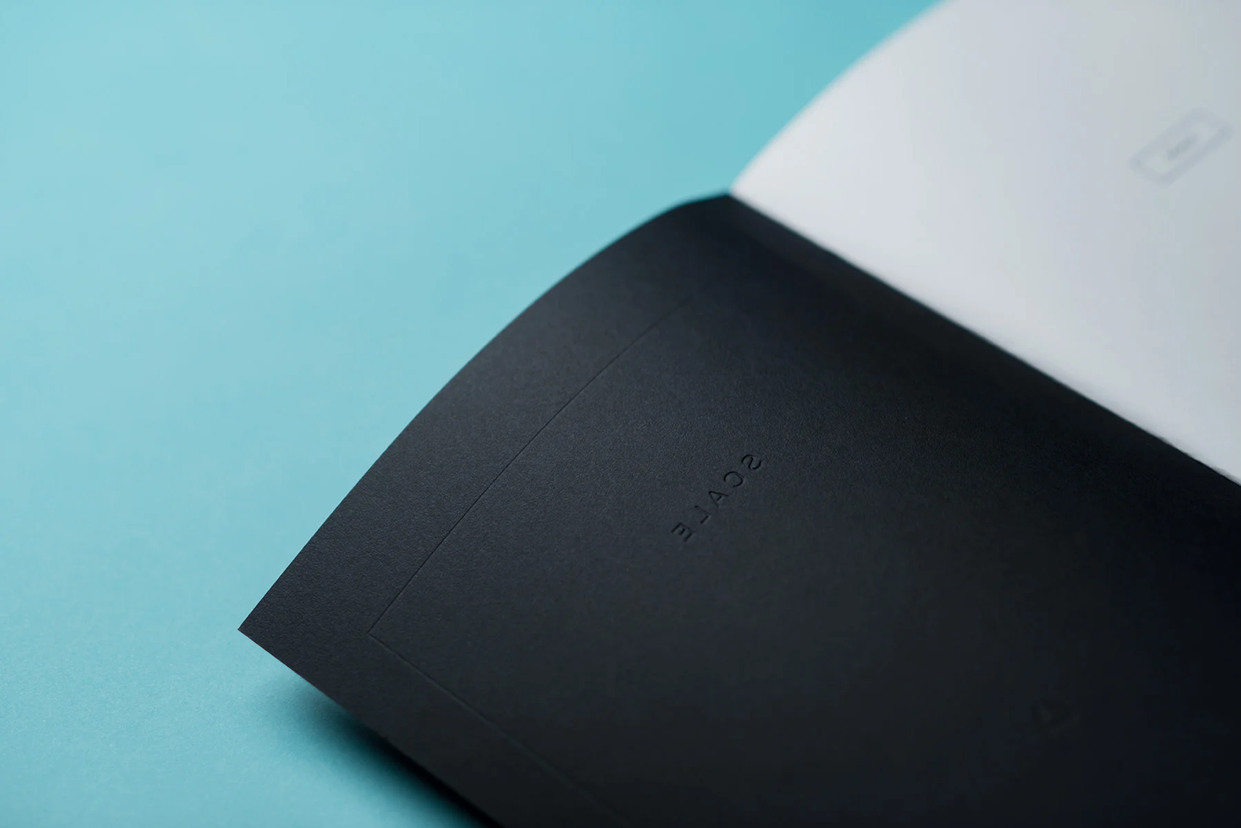
Designing The Cover
I wanted to create a cover that had strong resonance with the book's interior, as well as make a complementary connection to other aspects of the AppDirect brand.
To meet this objective, I kept the adornments minimal, and relied on familiar material choices—a cover stock that I'd previously selected to produce AppDirect's business cards, and Pantone spot silver.